DuckstersDucksters
History Biography Geography Science Games

Kids Math

Picture Graphs

Skills Needed
Basic Graphing
Percentages
Multiplication
Addition

Picture Graphs

Picture graphs are a way to show data and make it easier to read. If we just look at a bunch of numbers on a list or spreadsheet a lot of times it just looks like a bunch of numbers. However, if we can graph the numbers in the right way, the data may take on new meaning for us.

Using picture graphs can be fun. There are three types we are going to learn how to make in this lesson: Line graphs, Bar graphs, and Pie graphs. Note: These are sometimes called charts instead of graphs.

Line Graph

In a line graph we graph each point of data and then draw lines between each point.

Here is an example:

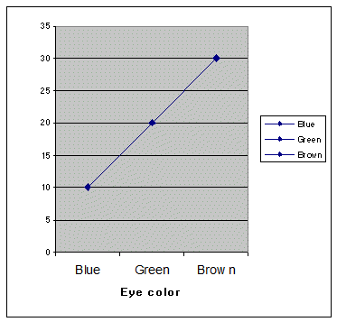
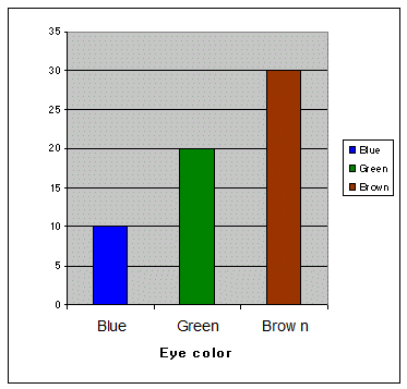
There are 60 kids in the class room; 10 have blue eyes, 20 have green eyes, 30 have brown eyes. Make a line graph of the color of eyes vs. the number of kids.

So first we must construct our graph. We put kids on the vertical axis along the left side. We'll make line marks at every 5 kids on the vertical. Then we'll put color of eyes on the horizontal axis (the flat one) and put blue, green, and brown.

Directly above blue we put a dot on the 10, because 10 kids have blue eyes. We also put dots on the 20 above green and 30 above brown. Now we draw a line between the dots and we have our line graph.


Line graphs can be good to show how a data set is trending. If the line is dropping or going up then we know which direction the data is moving. This could be over time, speed, or any other type of variable.

Bar Graph

In a bar graph we no longer just put a dot and then connect the dots. For a bar graph we draw a bar from the horizontal axis to the data point. We do this for each data point. See below for how we would graph our example of kid's eye color.


Pie graph

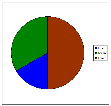
A pie graph could also be called a circle graph or chart. In a Pie graph we start out with a circle. Then we divide up that circle into pie pieces according to the percentage each component of data has.

In our example, we'll first need to change the data into percentages:

30 out of 60 kids have brown eyes. That's easy. 30/60 = ½ = 50%. 20 out of 60 kids have green eyes. 20/60 = 1/3 = 33% 10 out of 60 kids have blue eyes. 10/60 = 1/6 = 17%

Now we slice up the pie and graph it as shown below.


Advanced Kids Math Subjects

Multiplication
Intro to Multiplication
Long Multiplication
Multiplication Tips and Tricks

Division
Intro to Division
Long Division
Division Tips and Tricks

Fractions
Intro to Fractions
Equivalent Fractions
Simplifying and Reducing Fractions
Adding and Subtracting Fractions
Multiplying and Dividing Fractions

Decimals
Decimals Place Value
Adding and Subtracting Decimals
Multiplying and Dividing Decimals
Statistics
Mean, Median, Mode, and Range
Picture Graphs

Algebra
Order of Operations
Exponents
Ratios
Ratios, Fractions, and Percentages

Geometry
Polygons
Quadrilaterals
Triangles
Pythagorean Theorem
Circle
Perimeter
Surface Area

Misc
Basic Laws of Math
Prime Numbers
Roman Numerals
Binary Numbers


Back to Kids Math

Back to Kids Study


Ducksters Footer Gif with Ducks


About Ducksters Privacy Policy 


This site is a product of TSI (Technological Solutions, Inc.), Copyright 2024, All Rights Reserved. By using this site you agree to the Terms of Use.